Our work
Real sites for real businesses.
A software startup and a food stall. Different businesses, same goal: make it obvious what they do, and make the next step easy. Scroll through the live sites below, then read how we built them.
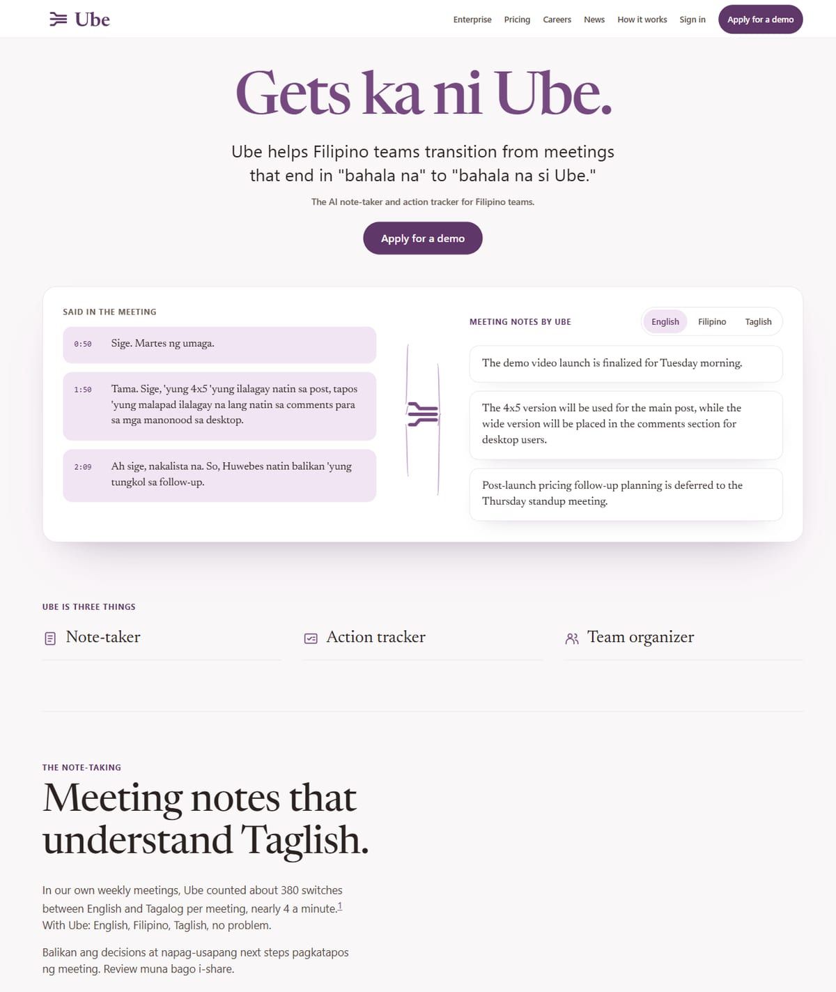
Ube
A product site for Ube, the AI note-taker and action tracker for Filipino teams. It speaks Taglish from the first line, so the teams it's built for see themselves straight away.
- A live example on the home page turns a real Taglish meeting into clean notes
- One clear next step, "Apply for a demo", on every screen
- Pricing, enterprise and how-it-works pages that explain the product in plain words
- Website design
- Build
- Product storytelling
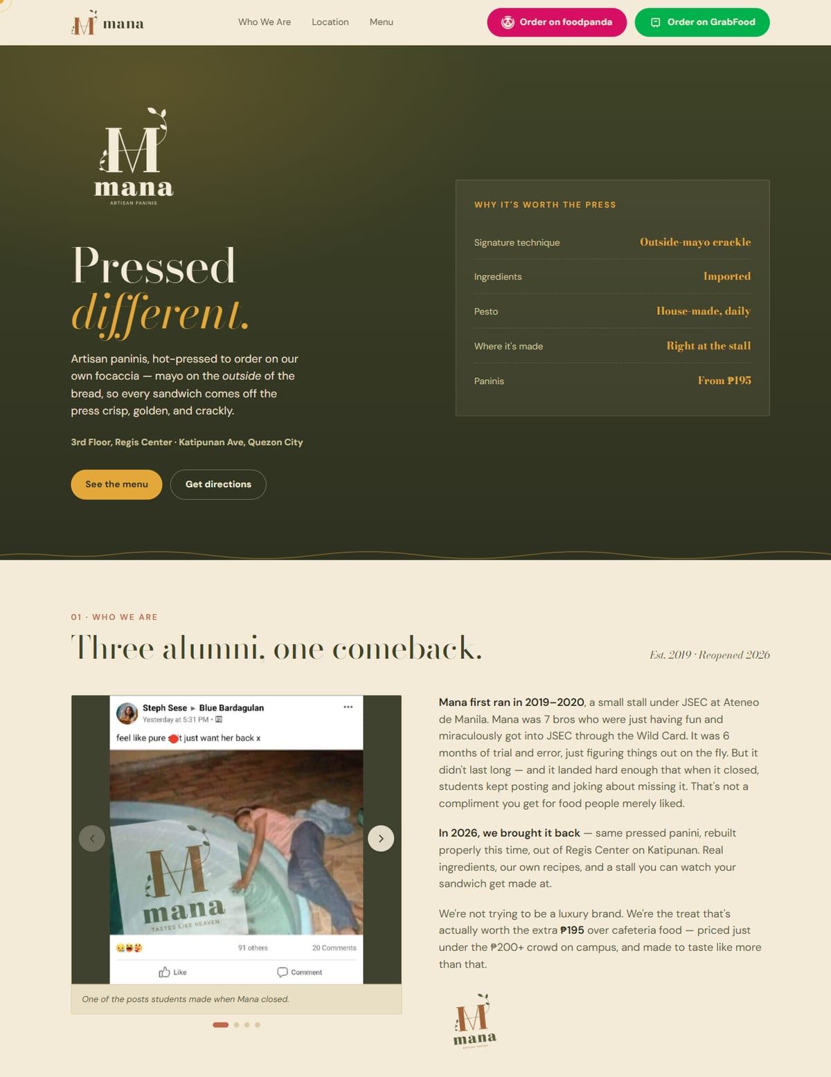
Mana
A site for Mana's comeback: artisan paninis pressed to order at Regis Center on Katipunan. The menu, directions and delivery ordering are all one tap away.
- foodpanda and GrabFood order buttons right in the header
- Step-by-step directions to the stall, plus opening hours
- The comeback story told with the students' own posts from when Mana closed
- Website design
- Build
- Brand story


Case study · Software · AI note-taker
Ube
A product site for Ube, the AI note-taker and action tracker for Filipino teams. It speaks Taglish from the first line, so the teams it's built for see themselves straight away.
The brief
Ube is an AI note-taker and action tracker built for Filipino teams. Its meetings happen in Taglish, so most note-takers miss half of what’s said. Ube needed a website that made that difference obvious in seconds, and turned curious visitors into demo requests.
What we built
- A headline that speaks the customer’s language. “Gets ka ni Ube.” Filipino teams see themselves in the first line, before they read a single feature.
- A live example instead of a feature list. The home page shows a real Taglish meeting turning into clean English notes, so visitors understand the product without a sales call.
- One next step, everywhere. “Apply for a demo” sits on every screen, so whenever someone is convinced, the button is right there.
- Pages that answer the hard questions. Pricing, enterprise and how-it-works pages explain the product in plain words, so the sales conversation starts further along.
Why it works
Software sites often try to say everything. Ube’s says one thing clearly, shows it working, and asks for one action. And it went live in under 72 hours from our first chat.
At a glance
- Business
- Software · AI note-taker
- Where
- Philippines
- What we did
- Website design, Build, Product storytelling
- A live example on the home page turns a real Taglish meeting into clean notes
- One clear next step, "Apply for a demo", on every screen
- Pricing, enterprise and how-it-works pages that explain the product in plain words
What shocked us was how fast [the twins] were able to make our website. It was probably even faster than 72 hours.
Case study · Food stall · Artisan paninis
Mana
A site for Mana's comeback: artisan paninis pressed to order at Regis Center on Katipunan. The menu, directions and delivery ordering are all one tap away.
The brief
Mana makes artisan paninis, pressed to order, at Regis Center on Katipunan. After closing for a while, Mana was coming back, and the students who had missed it needed to know: it’s open again, here’s where, and here’s how to order.
What we built
- Ordering in the header. foodpanda and GrabFood buttons sit at the very top, so a hungry student can order in one tap without scrolling.
- Directions that actually help. Step-by-step directions to the stall and clear opening hours, because “where exactly is it?” is the first question every new customer asks.
- The comeback story, told by the customers. We used the students’ own posts from when Mana closed. Nothing sells a reopening better than people who missed it.
Why it works
A food stall’s website has one job: get people to order or to show up. Mana’s puts both actions first, and lets loyal customers do the convincing.
At a glance
- Business
- Food stall · Artisan paninis
- Where
- Katipunan, Quezon City
- What we did
- Website design, Build, Brand story
- foodpanda and GrabFood order buttons right in the header
- Step-by-step directions to the stall, plus opening hours
- The comeback story told with the students' own posts from when Mana closed
Quote coming soon.
What every site gets
The same four rules, whatever you sell.
A panini stall and a software company need very different websites. They need the same four things underneath.
One clear next step
Order, book, call or message: every page makes the action you want obvious and one tap away.
Built for phones first
Most of your customers will see your site on a phone. We design for that screen, then make it beautiful on laptops too.
Fast on real connections
Slow sites lose visitors before they load. We test on a mid-range phone over slow 4G, not just on our own laptops.
Ready to be found
Every site is built so Google and AI tools can understand what you do and where you are.
Want your business on this page next?
Tell us about itYour business could be the next case study.
Send us your business name on Viber. We'll design a free preview of your homepage, and you only pay if you love it.